

Back when websites were only brutal because they had to be. Nowadays going brutal is more of a design choice. A way to stand out and rebel against the ‘samey’ designs that currently fill the world wide web.
But, don’t be fooled, brutalist design isn’t as easy as it looks. It’s hard to make a website look simple, beautiful AND ugly all at the same time!
Brutalist websites are designed to make you feel something…or at least not forget the website any time soon.
You see, that’s what brutalist design is all about! It ignores conventions of standard design and strips things down to create a memorable experience.
And isn’t that a beautiful thing?
In this article we’ve compiled examples of 15 of the most wonderfully weird brutalist websites out there, let’s take a look…
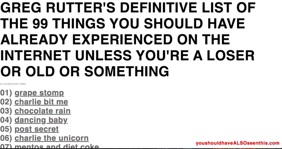
The content here is pretty straight forward. Just a simple list, built by one single guy. Made up of things on the internet, that he thinks you should have seen, in his words “Unless you’re a loser or old or something”.
As well as the concept being simple, the whole design is too. The colours, fonts and even the layout. The brutalist parts are the intense capital letters, followed by the lower case below. Mixed in with the tone of the website copy, you’ve got a pretty weird mixture of elements.
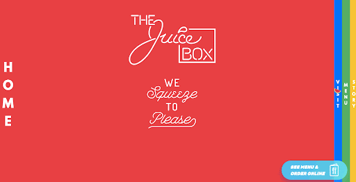
This is a more commercial website for a local juice bar in America. Showing that Brutalist design can work, pretty much anywhere with a little thought.
This is quite low on the spectrum of ‘Brutalist’ but the bright colours, eye catching navigation and the fun cursors certainly make it memorable.